{1} Right off the bat, designer Heather Raffel of Sugar River Stationers understood the relaxed vibe Rachel Hallihan and Joseph Licata wanted for their rustic June wedding. “Everything from her peachy gown to the chicken wire for their place cards breathed farm-to-table,” she says. A well-loved quilt inspired the pale pink print. The white font was inked twice to pop against the charcoal cardstock, calling to mind a blackboard at a roadside farm stand. The invitation was silkscreened, which added the slightly imperfect, handmade feel the couple was after. For a truly memorable presentation, the invitation arrived in a keepsake box brimming with straw.
{2} KC Didier wanted to keep things simple for her wedding to Brandon Moore, but searching for invitations online was anything but. She couldn’t find anything that felt right and she found herself stressing over the endless options. Overwhelmed, she turned to Jan York of All About You Designs, who was happy to guide her through the process. “I only design custom invitations, and after looking through page after page of fonts with KC, I asked if she had a favorite for everyday use,” says Jan. “She did, and once we decided to use that, it really drove the invitation.” The final product is sleek and elegant, with a unique horizontal format. Metallic cardstock in opal and pewter perfectly matched the bride’s swatches and lent a touch of luxe sophistication.
{3} Bishops Bay golf course in Madison was the inspiration for Alexandra Bochniak and Devin Murray’s wedding invitations; after all, the pair are both avid golfers, and Devin works at the course. They asked Heather Raffel of Sugar River Stationers for a design that felt contemporary and included a palette inspired by the course itself—navy blue with a wide spectrum of saturated greens. The laser-cut sleeve pays homage to Madison’s historic Art Deco and Frank Lloyd Wright-designed architecture, while the invitation insert echoes an illuminated stained glass window. Full-color offset printing adds rich, vibrant color and foil-stamped text jumps off the page. The result is a clean and modern design that still embraces tradition.
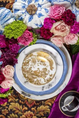
{4} This fall, Elizabeth Webber faced the ultimate design challenge. Her client, Denise Merkel, was not only her mother, but her business partner, too! Since they run Coqui Design as a mother-daughter team, working together on this personal project was a labor of love. “She knows what I like,” says Denise. “It’s traditional mixed with modern.” Denise and her husband-to-be love the look of calligraphy, so Elizabeth customized the font so their names would interact perfectly. The classic floral print reflected the natural beauty and quiet elegance of their country club wedding, while the color scheme of plum, pink and a pop of chartreuse kept it fresh and contemporary.
