Pretty in Pink
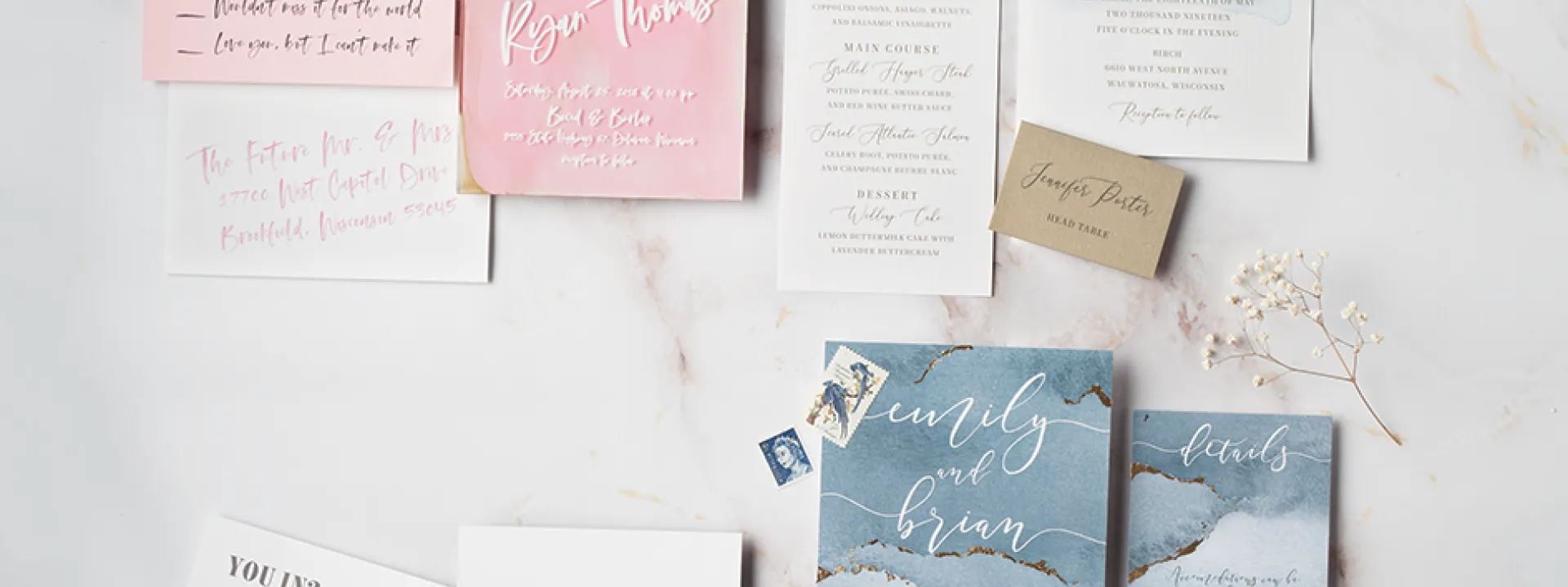
Mixed media make for an on-trend, whimsical presentation in this suite by Coqui Paperie. The invitation features bold calligraphy announcing the event on a clear acrylic overlay, with a blush, gold and white background; gold edging adds a touch of glam. The reply card is right in sync, with the loose, casual font like a note from an old friend.
Up in the Air
Fresh as a rain-washed sky, shades of blue paired with gold can be a perfect palette for any season—and lend a serene feel to this suite from Paperwhites. Classic lettering joins airy “handwritten” highlights, for a casual yet romantic design. Mixing white type and more traditional inks on gold leaf cardstock adds a subtly expressive edge.
Shades of Blue
Hand-painted blue watercolor splashes against textured cardstock; add a vellum band and reply envelope, and you get a modern suite from Cracked Designs. Serif and sans-serif fonts mix it up for the main details, while cursive type spells out the slightly sassy RSVP card. “Fun and witty wording is great to work with,” says Tara Scheuerman, designer and owner, “because it can really showcase the character, not only of the couple, but of the kind of wedding day it’s going to be.”
Water’s Edge
Inspired by the frosty beauty of ice caves, designer Danielle Cole of DCo Lovenotes laid the groundwork with a lush painting in watercolor, then scanned and layered her results for greater depth. Hand-foiling with gold leaf makes each piece unique and luxe. The whimsical font adds a light, personal touch. Whether walking the water’s edge in winter or on a boat in summer’s twilight, the dusky blues in this suite nod to Wisconsin’s lakeshore tradition.
Abstract brushes of color grace these invitations with a whisper of mystery.
Written by
Sherri Hildebrandt
Published:
Spring/Summer 2019
Season:
spring
summer
